If you want to survive in this fast-growing and highly competitive market, it is crucial to run your business efficiently and follow some best practices.
The following tips will help you better understand what to consider when designing your new restaurant menu. This will make your menu easy to read, consistent with your branding and optimised to increase sales significantly.
1. Describe your dishes as vividly as possible
Use descriptive adjectives in your menu to help your guests understand how the dishes look, taste or what consistency they have. For example, crispy, creamy or fried words evoke a particular inner image and appeal to different senses.
2. Be brief
Make sure your menu item descriptions are short and to the point. Your customers do not always want to spend a lot of time reading long and detailed descriptions. This could even cause your business to slow down overall. Orientate yourself to a text of about two lines and describe the ingredients, the taste, the consistency and the appearance.
3. Mention the origin of your ingredients
If your ingredients are sourced from a particular location, you can add special value to your dishes by mentioning that. “Sun-ripened Italian tomatoes” immediately sounds much tastier than just “tomatoes”!
Even though this makes your meals more appealing to guests, don’t overdo it and only mention the real origin of the ingredients – because your customers will be able to spot false claims!
4. Display your prices correctly
This step can be a little tricky. Even though restaurant patrons judge the quality of dishes by their prices, many opt for the cheaper menu items anyway. Studies have shown that prices are perceived as more reasonable if no currency symbol is next to them. If possible, also avoid dots or zeros after the price. This has a similar psychological effect on consumers.
5. Represent your brand
Your menu should include clear descriptions of your dishes, but it also provides an opportunity to showcase your brand. Studies show that the average visitor spends no more than 109 seconds looking through the menu. Keep this in mind when determining menu style and structure and how to present your best offerings as effectively as possible. Don’t just sort your dishes into categories; make it easy for your guests to skim the titles. Emphasise specific points in bold, italics or another font and use your brand colours.
6. Brainstorm for an optimal layout
Have you ever been to a restaurant that serves excellent food but has a horribly designed menu? Were you slightly irritated that you had to read all the detailed descriptions because a quick skim of the menu was simply impossible?
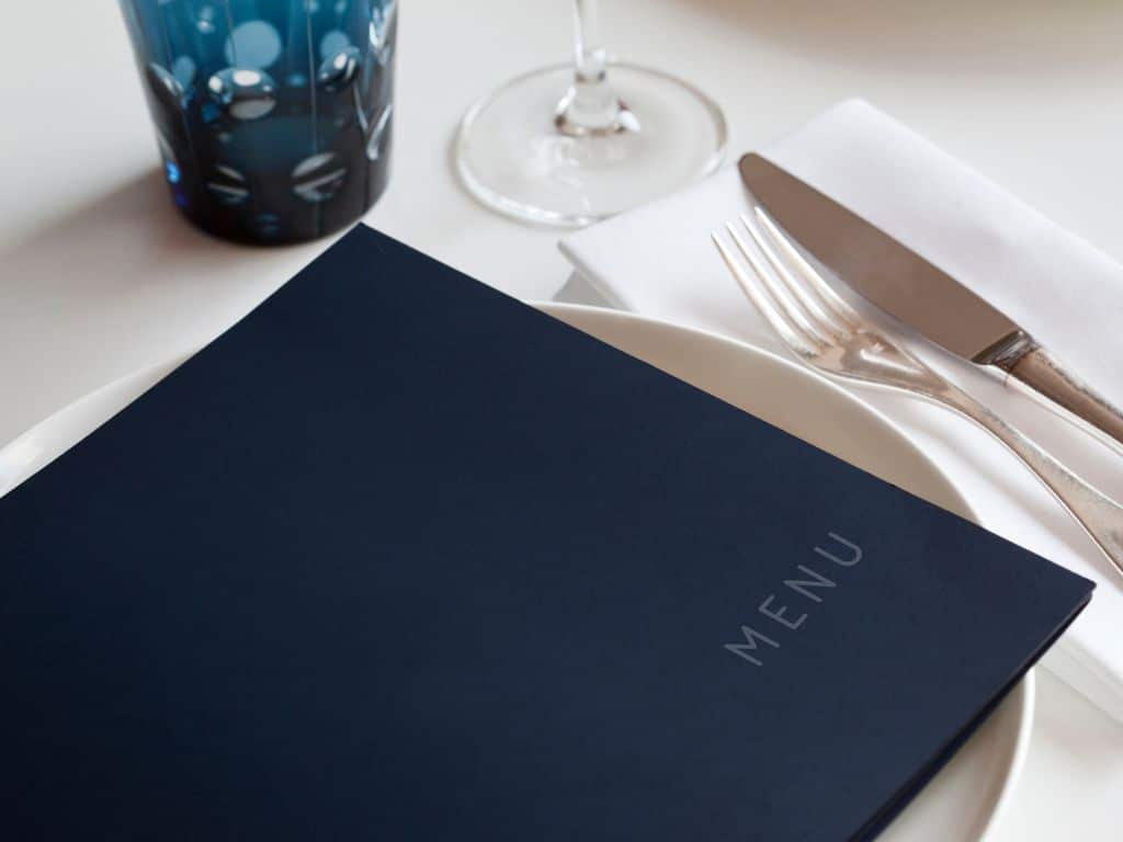
The cover, colours, material, and style are crucial to your menu’s overall impact on visitors. Think of your menu as an addition to your restaurant décor: The interior design theme should also be reflected in the menu.
A perfect menu is just the beginning!
At Doxzoo, we will be happy to advise you on your menu options so that you can get even more out of your restaurant.
Looking for a reliable printing company?
Get an instant quote