Table of Contents
Explaining typography: what is it?
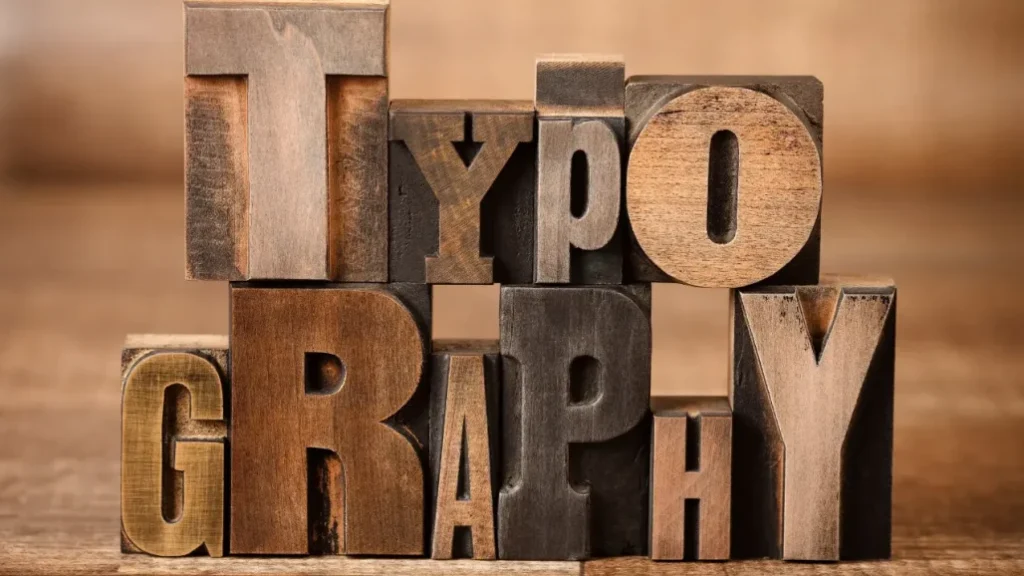
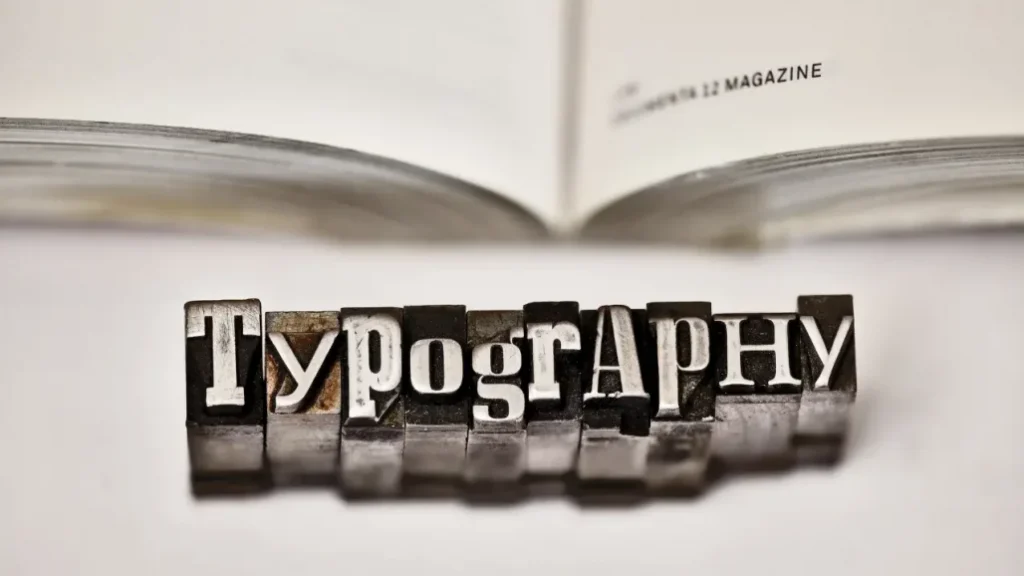
Whether it’s a website, blog, brochure, poster or customer magazine – typography is of utmost importance for every text genre. But what is typography, actually? Typography is the use of type, arrangement, and design to structure text information in a way that promotes reading. Good typography is characterised by the fact that the use of font families and markings is chosen with care. The more clearly the typography supports the content, the more likely the message will be received. In other words, the good design enables the reader to perceive the content quickly and without errors visually.
Five typographic mistakes
1. Underestimating typography
Don’t make the typographic mistake of underestimating the importance of typography. Along with logo and colour impression, typography is a crucial recognition feature of your company and brand.
2. Too many fonts = bad typography
You should use a maximum of two different fonts simultaneously for your communication. Different font sizes should also be limited to three when structuring text.
3. Poor readability as a significant typographical error
The readability of a text is the highest priority for good typography. Ensure that the line length is limited (max. 80 characters per line) and that the line spacing is sufficient (at least 120% of the font size). Texts in capitals are more challenging to read.
4. Justified vs flat type
Since justified type causes irregularly large spaces between words and more frequent word separations, especially in narrow columns, a left-justified flat setting is preferable. The justification should not be used on the web, as this would be a serious typographical error.
5. Visual Hierarchy for good typography
The text should convey information in a well-structured way. A hierarchy is essential for this. This makes it easier for readers to absorb the content and find the information they seek more quickly. Structure your text with headings and subheadings that are differentiated by size or font style. On the other hand, paragraphs that are too long without a subdivision are considered typographical errors.
Basic Rules for good typography
Some basic rules must be observed for a typographic design to fulfil these tasks. As an agency for conceptual communication, we are experts in typography – offline and online channels. We want to present our top 10 tips for successful typographic design. This will help you avoid classic mistakes and score points regarding design.
1. Less is more
Probably the most popular mistake for newcomers to typography is the tendency to want to design as much as possible. Good typography, however, is characterised by white space. This is what empty spaces on a page are called. It is these that enable content to be shown to its best advantage. If, on the other hand, too much information and too many graphic elements are crammed into a small space, this effect is counteracted. Instead of catching the eye, the design is lost in the mass of visual impressions.
2. The choice of typeface
Objectively sober or expressive and emotional? There are thousands of typefaces – and your choice is by no means arbitrary. For good typography, the key question must always be: which typeface suits the content? The font can be deliberately eye-catching and emphasise the content, or it can be more discreet so that the content is in focus.
3. Do not use too many different fonts
Once you have discovered the abundance of fonts, you quickly want to use as many as possible. What is supposed to stand for variety and increase reading pleasure quickly ends up in chaos. Experienced designers, therefore, recommend using at most two different fonts for successful typography.
4. Contrasts create tension in typography
However, you should never use only one font. To increase readability and to emphasise differences – for example, between body text and headlines – it is best to choose between two different font families. For headlines, experienced typographers recommend a typeface without serifs (Grotske), whereas a serif typeface is recommended for bulk text.
5. Font sizes: How big can it be?
A font size of 8 to 12 points is recommended for mass text. And what about the headline? This should be twice as large for appealing typography. In other words, if the body text is set in 12-point type, the headline should be 24-point.
6. Get to the point with font sizes
Good typographic design usually means using design options in a reduced way. This also applies to the choice of different font sizes. Set one for the headline and one for the body text according to the rule from the previous tip. If necessary, add a third font size for subheadings. However, you should not vary the font sizes more than this.
7. Use font markings sensibly
Admittedly: This example shows how not to do it. Instead, you should follow the path of modern typography when choosing your font markup – i.e. whether a font is set in italics, semi-bold, bold or even extra-bold. This involves deliberately creating contrasts between different content elements to increase readability. For example, set subheadings in bold to create a distinct contrasting effect.
8. Is it justified type king?
For a long time, justification with its symmetrical word alignment was considered typographic dogma. But at the latest, since texts appear on the internet and their alignment fluctuates due to the size of the browser window or the choice of the end device used. Ideally, an experienced typographer should set the justification individually for you. However, this is time-consuming and labour-intensive. It is better to choose the left justification to avoid unsightly holes in the text without much effort.
9. A commitment to bullets
Can you recognise the individual lines here? This is made possible by our bleed-through. This refers to the space between the individual lines. This should be at least one fifth of the font size or more for successful typography, according to a rule of thumb. Note that the longer the text, the larger the spacing should be
10. Line length is crucial
Neither too long nor too short – this is how the line length should be chosen for a readable typographic design. About ten words or 50 characters can be taken as a guideline for a line length for the column widths of multi-column brochures or magazines. For single-column printed matter, the value can be increased to 70 characters per line for books up to twelve words.
Looking for a reliable printing company?
Get an instant quote
1 Comment
Way Cool! Very helpful and useful tips and Principles. These tips are very effective for beginners. Thanks for finally sharing this article. I will definitely come back to your website.