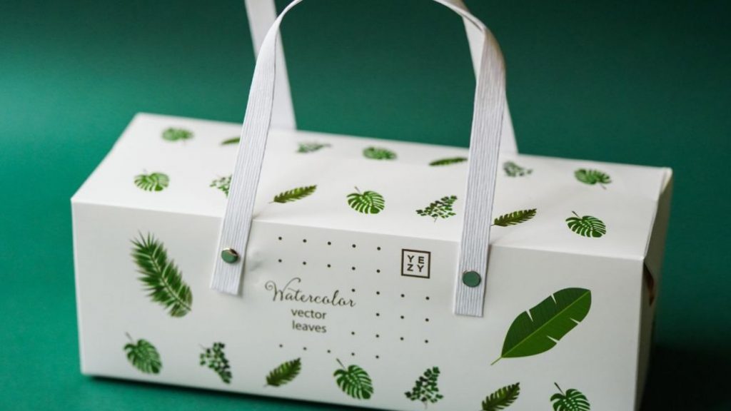
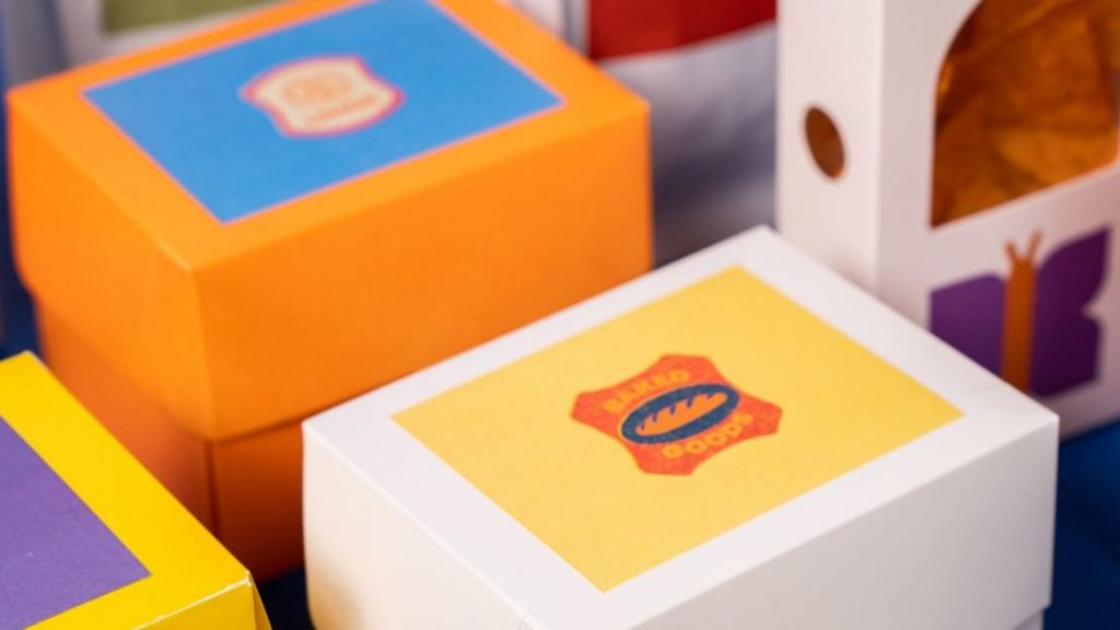
E-commerce is thriving. With just a few clicks, one can add anything they desire to their virtual shopping basket. Whether delivered straight to the doorstep by a courier or collected in person from a storefront, the first thing that catches a customer’s eye in this context is not neatly aligned products on shelves, but the packaging. Dull packaging dampens anticipation and misses valuable opportunities for customer retention. Those who don’t give your packaging a second glance will likely have half-forgotten your brand before the first strip of tape is removed. Recognition? None! However, packaging is much more than just a practical aid for shipping and transportation.
In this blog, we’ll reveal what makes for successful packaging design and how your brand can benefit from it. Additionally, we’ll provide valuable tips for designing and implementing three-dimensional packaging designs. So, let’s get started!
The Power of Packaging Design: From First Contact to Regular Customer in Just One Delivery
Even without direct competition on either side of the shelf, the first impressions in online shopping are still made or broken by product presentation. The home shopping experience enters its final phase with the reception of the parcel. A nondescript, unbranded package neither delights the customer’s eye nor fortifies their connection to your company.
With a distinctive design, your packaging becomes the emblem of your online store, drawing eyes to it as if by magic. Here, emotions are key. Thoughtful details combined with well-considered design create an emotional connection to your brand, laying the foundation for a positive first contact with your online store. As an integral part of the shopping experience, your packaging distinguishes itself from other shops and fuels your customers’ eager anticipation and curiosity. Your company remains firmly in the recipients’ minds from the start, elevating your status as an attractive brand. In this way, first-time buyers quickly become regular customers.

Packaging as Brand Ambassador
Whether it’s in-store or online shopping, individual product packaging acts as an extended arm of product marketing and serves as the mouthpiece of your brand. Therefore, the product and its packaging should never be considered separately during the design phase but should always be thought of as a unit. Convey the message of your brand through your product packaging and give customers an appealing preview of what’s inside. This not only promotes your company’s recognizability but also scores points in competition with other shops. For monthly subscription boxes or multi-part product sets, a separate outer packaging is optional. Instead, all products can be delivered in a printed transport package. The packaging primarily serves as the business card of your brand and can also attune customers to your box’s theme with memorable slogans and design tricks.
The level of detail in your design should depend on your product and target audience. For presenting multi-part high-quality product sets, a subtle packaging design provides an appropriate frame. In the design, focus on small details in the colours of the product range or corporate design and let the items speak for themselves. Investing in intricate packaging design can, however, pay off. In times of growing social media presence, creative packaging resonates well, not just with younger demographics. If your packaging impresses as a lovingly designed total package, many customers are likely to share their enthusiasm through unboxing videos on their private social media channels. With every like and share, the chances increase that new customers will find their way to your online store.
Packaging brings to life the identity of your brand not just through its design but also as a multi-sensorial marketing tool, conveying values and emotions through both its visuals and touch. For example, sturdy lift-off lid boxes suggest stability and security. These two-part boxes, thanks to their hollow edges on the sides, top, and bottom, are suitable for shipping and securely deliver clothes or cosmetic sets to their destination. In contrast, pillow boxes, with their curved exterior and semi-circular closures, are perceived as particularly elegant, enhancing the presentation of delicate items like jewellery or cosmetics.
Future Packaging Artists: From Two-Dimensional to Three-Dimensional Packaging Design
The most intricate part of packaging design is the three-dimensional space. What looks fantastic on the die-cut sheet may suddenly appear the exact opposite on the finished packaging. Preparation is key. Once you’ve decided on a type of packaging, it’s best to first print a design template. In our Info Centre, you’ll find many packaging templates available for download. The marked die lines help you get your bearings and gain a feel for the packaging design. Before embarking on the creative work, you should also answer the following questions:
- Which visible areas need designing?
- Which areas, once the packaging is folded, are only partially or not visible from the outside?
- Where will the shipping label ultimately be placed?
- Which legally mandated details need to be integrated into the design?
Trust is good, but control is better. Once your final design is ready, we recommend one last check. Upon request, we can produce individually plotted dummies of your desired packaging to avoid any ambiguities. With the detailed packaging samples, you can assess the impact of your design and make any last-minute adjustments if needed:
- Are the texts easily readable?
- Does the design, combined with the slogan and logo, convey the desired message?
- Do the die and score lines interfere with important design elements?
Once the design withstands your scrutinising gaze, it can be finalised for printing and, depending on the type of packaging, additionally individualised with effect-enhancing finishing details. Print embellishments like foil lamination, 3D varnish, UV varnish, or hot foil stamping offer countless design possibilities and set you apart from the crowd. Using special colours from HKS or Pantone further enhances the recognisability of your packaging and adds colourful highlights. Guidelines for correctly applying print embellishments and special colours in your print data can be found in our file specifications.
A Compelling Conclusion
You can save the most space by storing your packaging flat. What might initially seem time-consuming will pay off in the long run. After assembling three packages, you’ll have gotten the hang of it, and the steps will come naturally. The flat packages are easily stackable and can find a spot in any free nook. In the final step, you can further enhance your package with creative inserts like handwritten postcards or stickers with your logo. Filling materials or adhesive tape, matched to the design colour, are also options to make the package even more exciting for your customers. The competition can pack up!
Looking for a reliable printing company?
Get an instant quote