Table of Contents
A brochure can be used in many different ways. Think, for example, of a brochure or a product catalogue. When you use printed material, one thing is sure: you will be using text. Using the right fonts is essential for looks and readability. Read on quickly and learn all about different fonts!
A good first impression with a brochure
You can only make a first impression once. So it is vital to make a good first impression right away. Because a brochure is a book with several pages, the cover is the most important thing. Make sure it looks attractive and invites them to read on.
Of course, the cover can vary from one brochure to another. Nevertheless, there is a guideline that you see in many successful covers. First, the title is prominent. For example, this can be a title and a (company) name. In addition, a short teaser to the brochure’s content always works well. Many magazines use an interesting or thought-provoking quote from an interview. But a product catalogue can also describe the content. You don’t want to give away everything, but you do give a hint to make people curious.
Something that should not be missing is a good photo or image. This will occupy the most space on your design and attract the most attention. Make sure you have a clear, bright picture that matches the style of the rest of the brochure.
Font size
There is nothing more annoying than text that does not have the correct font size. Too small is almost unreadable, but too big is unpleasant to read. So what is the ideal text size? For longer texts, it is between 9 and 12 pt. Of course, titles can be larger than the body text, up to 10x.
Not only is the size important, but also the layout and formatting. White spaces are particularly important. A page full of text with minimal white spaces feels anything but pleasant. So ensure you have fine line spacing and divide the text logically into paragraphs.
Types of fonts
Fonts can be divided into three different types:
- Serif fonts
- Sans serif fonts
- Fantasy fonts
Serif fonts
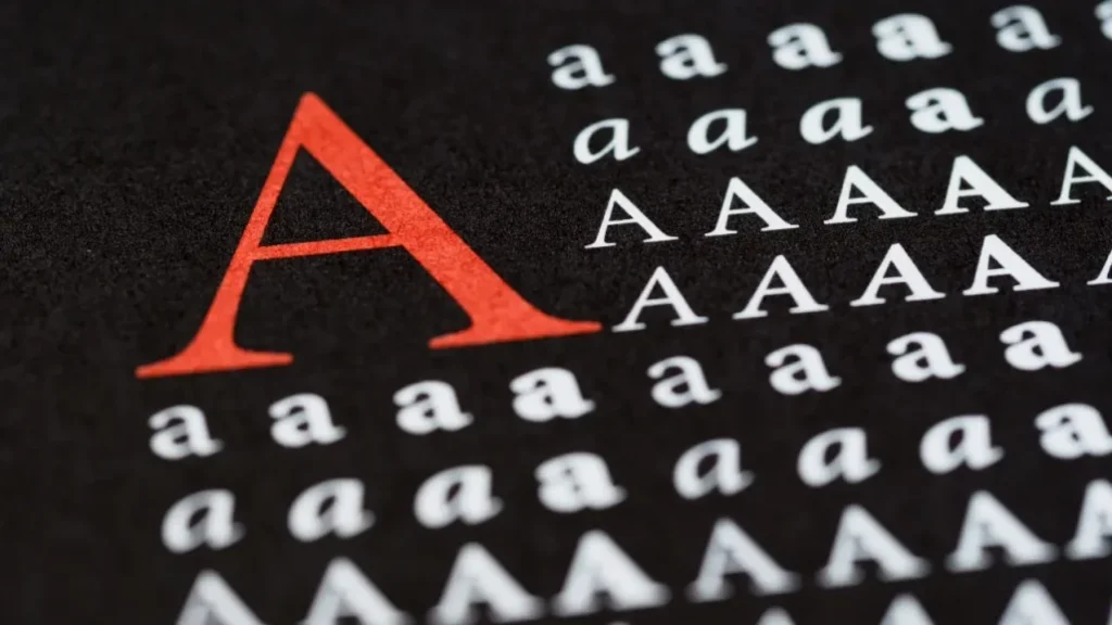
These are fonts that have a dash (serif) at the ends. This line makes distinguishing and recognising the letters easier for our brains. Especially with longer text, this makes reading a little bit more pleasant.
These days, however, this ‘rule’ has changed. For a modern look, a serif font is also regularly chosen with the risk that the text is less smooth to read.
Sans serif fonts
These are fonts with clean lines without the so-called serif at the end. These fonts have a modern and business-like appearance. Due to the absence of the serif, they may take slightly longer to read. For titles, subtitles, captions or other short texts, you can choose a font you like without any problems.
Fantasy fonts
These are often decorative fonts. Their readability, especially in longer texts, is generally not optimal. Therefore, try to limit the use of these fonts to (sub)titles only.
How many fonts can you use?
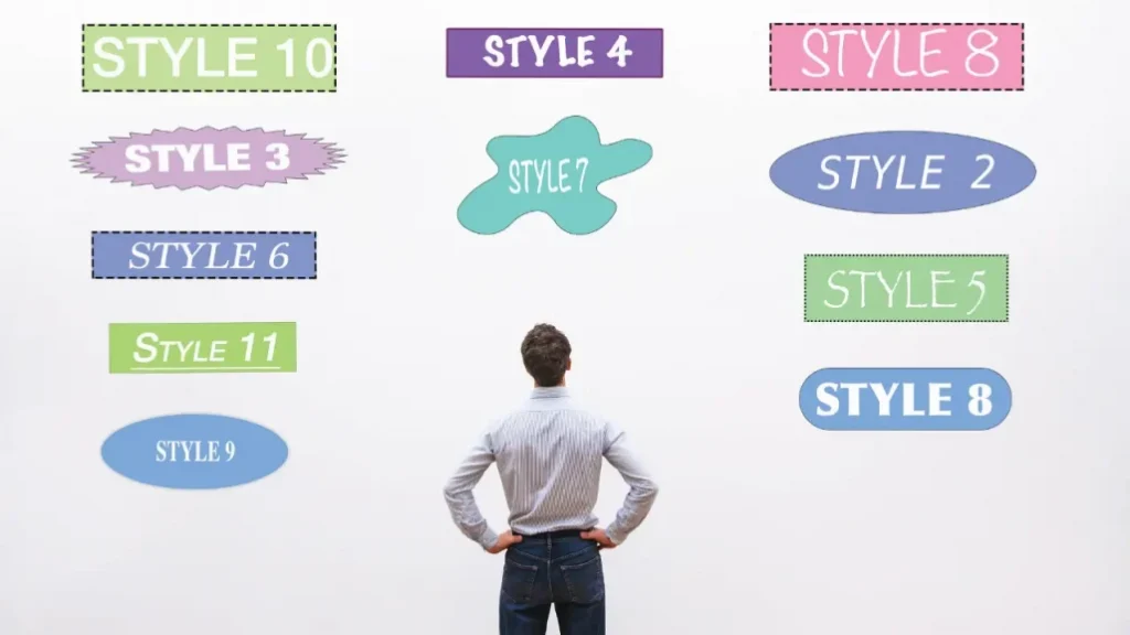
The fewer fonts you use, the more legible the text will be. But using different fonts can make the design look more fun. If you want to use multiple fonts, go for a maximum of three.
Fonts are divided into so-called families. These are fonts that are similar in appearance. The style rule is to combine no more than two different families. This way, you maintain unity in your design and make sure your document is easy to read.
Now you know all the basics about fonts and which is best for your brochure. We can gladly help and advise you on what to look for when you design a brochure.
Looking for a reliable printing company?
Get an instant quote