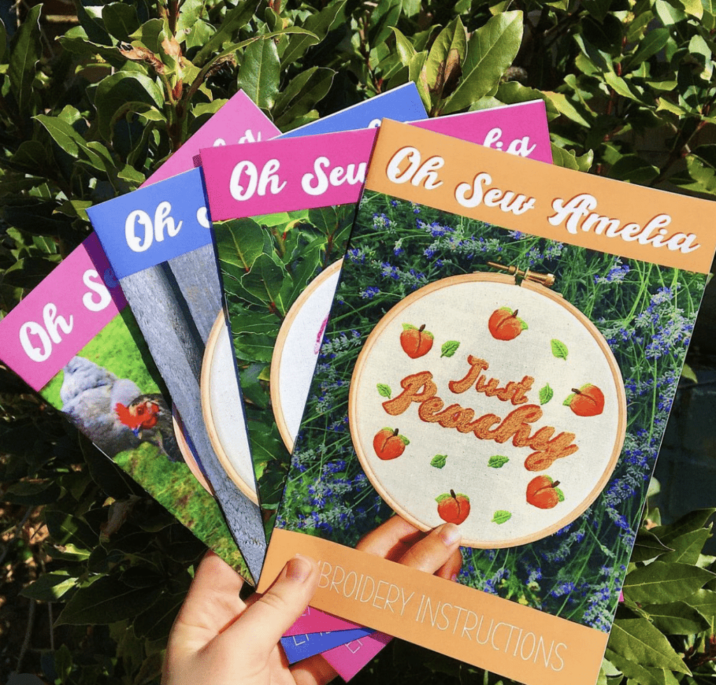
If you have poured months or even years of energy into creating a book, you will know that how you present it to the world really matters. A well-designed cover is crucial to attract readers if you are aiming for commercial success, but even a thesis or training manual will need an appropriate design to reflect its contents. Here are some tips to bear in mind.

1. Do some research
If you are taking on the task of designing the cover yourself, and you are not a professional graphic designer, a good place to start is to have a look at the work of others. This will give you some idea about what works well, and what appeals to your intended audience. Browse some titles in your genre, either online, at a library, or a book store.
2. Choose the format
It is important to know if you want a hardback or a paperback cover, as this affects the overall feel of the book. Certain types of novel, such as plot-driven thrillers and romances, are best suited to the paperback format. Thesis, training manuals, and photobooks are often produced in hardcover, but the choice is yours, of course.
You can add an extra dimension of tactility with a choice of matt, gloss, of soft touch lamination for the cover. Finally, choose a size that is most appropriate to the work; generally, paperbacks are smaller than hardbacks.
3. Decide on a layout
The cover must include essential information, usually the book title and the author’s name. It must also have a key visual draw, which can either be worked into the typography, or in the form of a separate image (see 4 & 5). The elements can be arranged over the cover in a structured grid, or one element can be emphasised over the others.
4. Chose a strong image
The eye is drawn more to images than to plain text, so it is important to have a strong visual focus on the cover. If you have trouble deciding, try creating a mood board of anything that catches your eye, from photos, illustrations, and graphics, and try to come up with your own interpretations, or put together collages.
If you don’t think you are particularly creative, you can also purchase stock images with the relevant reproduction permissions from various websites. Try and find images that say something about the themes, ideas, or mood of your work. It doesn’t have to be realistic, but it should be memorable. Colour is also important in setting the tone of a book.
5. Typography
The typeface can form the main visual focus of your cover if you don’t want to use an image. Experiment with adapting fonts with custom designs, creating hand drawn fonts, and using different colours, tones, and textures, to convey the content of your book.
If you are combining a font with imagery, you should take care to integrate them so they are not fighting each other. Whatever style of font you go for, make sure it is easily legible, so you don’t put potential readers off at first glance.
Please get in touch today for self printing service.
Looking for a reliable printing company?
Get an instant quote