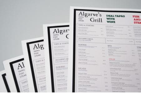
Typography is such a fundamental element of graphic design that we often don’t give it much thought. After all, we encounter it everywhere; on screens, billboards, and in newspapers and other printed materials. Yet the typeface you choose is an important communication tool. So how did the many different styles evolve?

A collection or set of letters in a particular style is also known as a font, although technically the word font refers to aspects such as size, weighting, italics, and so on, rather than the actual design. Some famous examples of typeface include Helvetica, Arial, and Times New Roman.
Most people, even graphic designers, will use the term font and typeface interchangeably, and unless you are a professional typesetter or web coder, the distinction probably doesn’t matter too much.
Typefaces have naturally changed and developed throughout history, as printing methods became more advanced, literacy became more universal, and also simply to satisfy the human need for fashion and novelty. The very first typeface was invented back in the 1400’s, with the development of the Guttenberg printing press.
Over the centuries, designs evolved to make the printed word easier to read. Until the early seventeenth century, they were all what is known as ‘serif’ styles. This is where a small line or stroke is attached to the letter stem, sometimes also called feet. No one is sure why this technique evolved; maybe it was simply considered more decorative.
Serif fonts are also considered to be easier to read in print, particularly at small scales, in a paperback novel, for example. They are used today to convey a classical, authoritative tone to a piece of writing. Times New Roman, which was developed in the 1930s, is the most famous example.
As the name suggests, the designer Stanley Morison was influenced by ancient Roman manuscripts, combined with the more modern and readable styles of the present age. The result was unveiled in the 3 October 1932 edition of The Times newspaper.
Morison has aimed to create an economical style that could maximise the amount of type that could fit on a page, with readability. He widened parts of the letters to make them stand out more on the page, while also thinning some parts, and making them slightly taller and closer together. The result was a much more rounded and clearer typeface.
Meanwhile, Sans Serif typefaces were invented in the early nineteenth century, where the letters have no tails and feet at all. At first, the style proved unpopular. However, by the early
twentieth century, they were hugely popular as a modern, forward looking style. This was encapsulated by the Futura typeface, developed in 1926 and still widely used today.
Even more famous is Helvetica. Arguably the most loved and ubiquitous typeface of all time, it was developed by Swiss designer Max Miedinger in 1957. Sleek, neutral, and easy to read, it’s a go-to font for many designers because it is aesthetically pleasing, without distracting from the message that is being conveyed.
If you need an online printing services UK, visit our website today.
Looking for a reliable printing company?
Get an instant quote